Government portal
Promotional video
- Tecnologies: After Effects / Cinema 4D / Illustrator
- Client: Mexico State Government
- Metodology: Waterfall
- Year: 2016
"How can we show citizens the main changes and benefits offered by the new government portal?"
My experience
The redesign of the government portal was my first experience in the world of UX and a very important challenge for me because of the size of the project and the amount of information it contains. Based on a benchmark of international governmental sites and based on the findings obtained in several tests with users (focus groups, A / B tests and interviews), we came to this design with which we obtained the 2nd and 3rd place in the ranking of governmental portals in the years 2014 and 2015.
My contribution
The most important points that we considered in the redesign of this portal were:
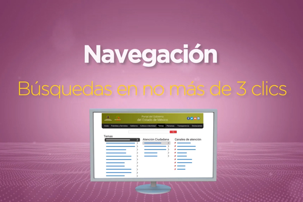
- Indispensable use of the search engine to reach the desired information much faster.
- SEO throughout the portal to get information from a search engine.
- Identification of several search alternatives to reach the same content.
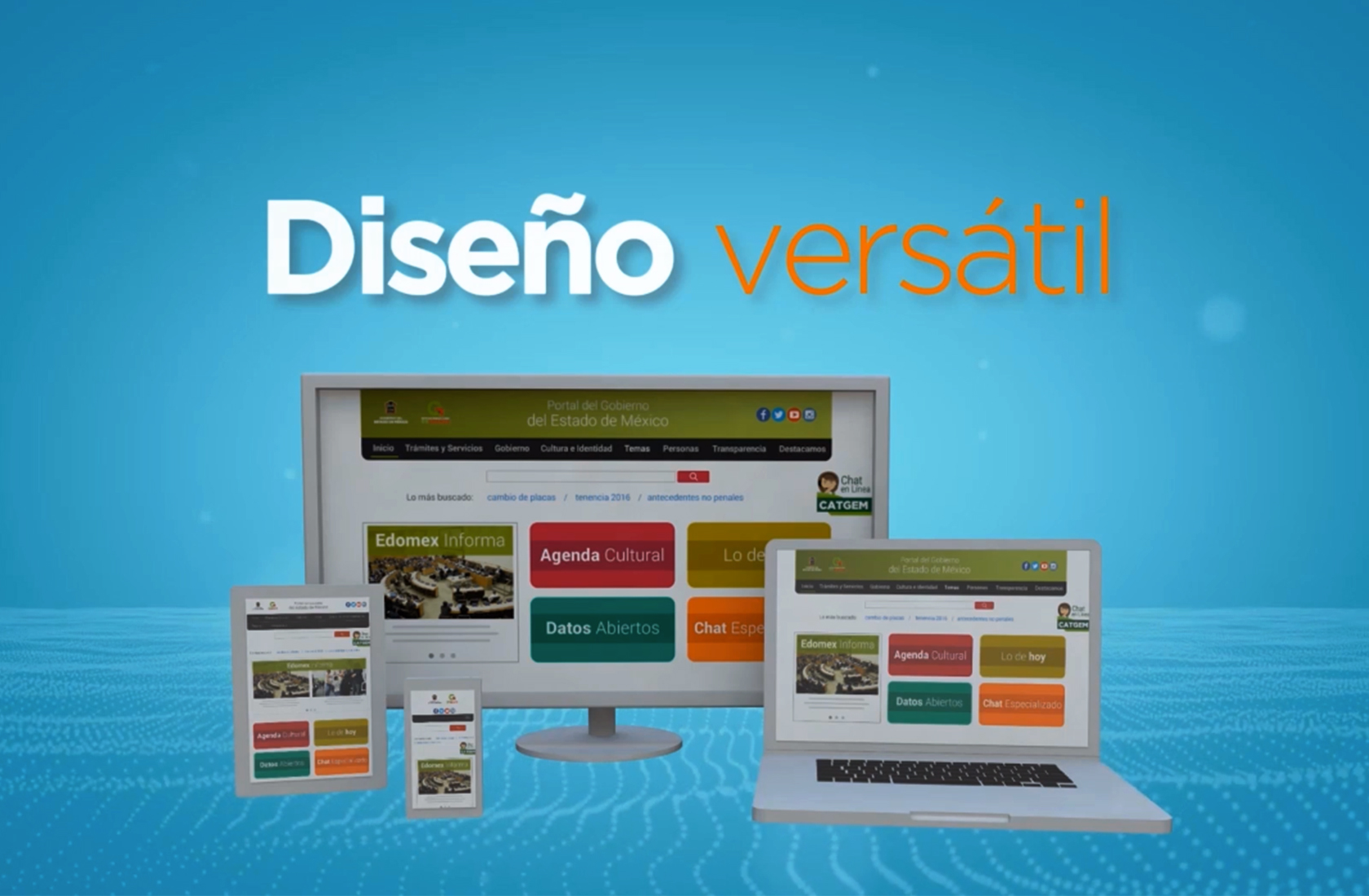
- Clean design and clear and concrete information.
- Prioritization of information to offer users temporary important content, shortcuts and information for emergencies from the main page.
- Minimization of levels of nagevación so that the user has virtually anything at hand.
Based on those key characteristics that led this solution to occupy such an important position at the national level, I designed this video that shows the citizens the main changes and improvements.
The result
From this video the people who consulted in the government portal, understood faster the main changes in navigation and ways to get to the information they need in a more agile way.